Column-count revisited
29 Jan 2025
In late 2023, I ran into an issue with the CSS column-count property behaving differently on iOS devices. I wrote about the issue here, but I’m not happy with my explanation of the issue and I’d like to write a more concise explanation now.
During a project, I used column-count to display images in a masonry layout similar to the kind of layout you may have seen on Pinterest and other websites:

As I explained in my previous post, this is a simple way to create the masonry effect, which stacks images from top to bottom and spreads them as evenly as possible across the number of columns specified. I’ve included sample code at the bottom of this post.
The problem
When viewing my columns on iOS devices, I noticed that the images at the top of the columns were not aligned. I recreated the problem back in 2023 for testing purposes using divs with some custom styling. Here’s a screenshot, visible on Chrome on an iPad Pro 12.9 2022 (the image quality is a little low because I used BrowserStack):
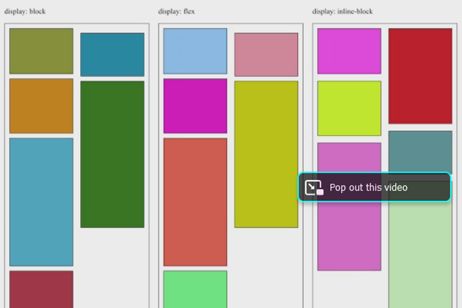
You can see that the boxes at the top of the second column in the first two sections are not aligned. This was the issue I saw in my project, but on Mac and Windows operating systems, that misalignment didn’t exist. It was only on iOS devices that I could recreate the problem.
Solution
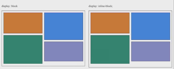
After some Googling, I found this Stack Overflow thread where someone was experiencing a similar problem, and the solution was to apply display: inline-block to the column items. This is why when I recreated the problem, I created the three different display values you see above, and you can see that the boxes with a display of inline-block are aligned.
Ironically, img elements are inline-block by default, and I had been using img elements on my project. The only reason I noticed this bug was because I had deliberately changed the display of my images to flex while I was still experimenting with ensuring my Next.js image components were rendering correctly. When I removed display: flex from my column items, the problem disappeared.
Updates
In the process of updating this portfolio I was revising my old notes, and I was curious to see if this problem was still relevant. I ran my old column-count tester page in a few different devices in BrowserStack, and the misalignment issue was gone. Here’s a screenshot of columns on Chrome on the iPad Pro 12.9 2022:
At some point between November 2023 and January 2025, the bug was fixed. Now you can use column items with display: block or display: flex without any alignment issues.
Lessons learned
At the time, I was unfamiliar with the fact that iOS uses a different browser engine to Mac or Windows and I initially assumed that the issue must have arose from a difference between Firefox and Chrome, rather than a difference between Chrome on Windows/Mac and Chrome on iOS. This was one of my first lessons in the importance of cross-browser and cross-device testing and understanding the technologies behind browsers.
Sample code
Here’s an example of the code used to create this effect:
And here’s the result:
Typically, you would be working with img tags if you were displaying images, but to keep things simple I used colored divs and prevented them from breaking across the column by applying break-inside: avoid to the blocks.
Experimenting with different display values
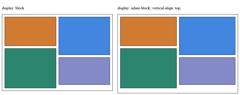
You can still experiment with the CSS properties to find more subtle differences in the behaviour of the column items. Below, I’ve applied inline-block to the column items, and you can see that the gap between the blocks is slightly wider than the gap between the columns, despite both being set to 10px.
But, if you then apply vertical-align: top to the items, that fixes the problem:
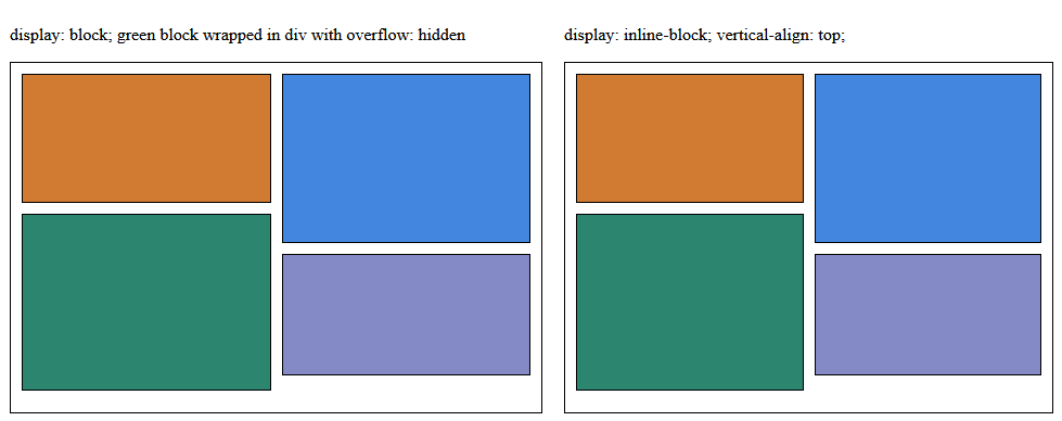
But if you then compare them side-by-side, there are still alignment differences, which you can see in the screenshot below, or live on my column-count tester:
It looks like the bottom margin of the lowermost block in the left column is collapsing into the container’s padding for the block items, but it’s stacking for the inline-block items.
This may be related to the fact that margins for inline-block elements do not collapse. Inline-block elements create a new block formatting context (BFC), which suppresses margin collapsing.
Applying overflow: hidden to the block elements also creates a new BFC. By wrapping the green block in an outer div with overflow: hidden, the collapsing is prevented:
My understanding of margin collapsing was that it occurs between margins, not padding; however, that doesn’t seem to be the case here. I’m curious why this behaviour is occurring, but at the moment I can’t find much information at all about padding collapsing into margins. It’s an interesting example of how unexpected behaviour can occur when combining CSS properties.