A flexible guide to building a custom theme toggle
20 Jan 2025
To offer an inclusive user experience, most websites have both light and dark modes. Some of the key considerations for implementing a theme toggle include the following:
- The default theme should initially reflect the user’s system preferences
- The theme toggler’s purpose should be intuitive and minimal
- It should be keyboard and screen-reader accessible
This is not intended to be an exact step-by-step manual, but a general guide that should help anyone wanting to get started in creating their own custom theme toggle. Copy-pasting the code segments should get you close to a toggle that functions like the one on this portfolio, but make sure you adapt it to your purposes or it probably won’t work.
Visual design
There are many different theme toggle designs online. Here are some examples:
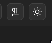
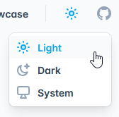
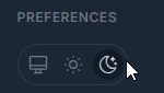

The first two designs (Mantine and Tailwind) are minimal, but displaying a sun icon when the page is in dark mode might look confusing to some users. For my current portfolio, I chose the fourth design (a switch) because it seemed to be the best visual representation of the actual function of the button; however, it also has some downsides. It’s slightly more cluttered than the first two designs, doesn’t allow the user to select a ‘system mode’, and creates some additional accessibility concerns to address. Ultimately, the design choice will come down to what is most suitable for the website in question, but the fundamental toggling logic stays the same.
Implementation: Building the logic with JavaScript and HTML Data Themes
In implementing the theme toggler logic on my own website, I initially took inspiration from Derek Kedziora’s guide. My code builds upon the code found in that guide; however, with several adjustments made in an attempt to simplify the logic and reduce repetition.
Using the data-* HTML attribute on the <html> element allows for defining CSS variables that change depending on the value of the attribute. For example:
Then, you can simply attach an event listener to a toggle button that toggles the data-theme between “light” and “dark”, which will update the CSS variables and therefore the color scheme of the website.
There are a couple of options to ensure that on a user’s first visit, the color scheme matches their system preferences. Derek Kedziora’s guide uses the prefers-color-scheme CSS media feature to detect the user’s system preferences:
This will work; however, it introduces some repetitive CSS where the variables need to be defined both inside and outside the media query. If you try to avoid the repetition by only defining the dark mode colors inside the media query and light mode outside the query, as shown below, the dark mode CSS variables will not be accessible to users who do not have a dark mode system preference:
^^This will not work.
An alternative to avoid this is to use JavaScript to detect the user’s preferred color scheme before the page fully loads, so that the correct color scheme is applied before the default CSS is loaded. To do this, create a checkTheme.js file that will be linked in the <head> of your HTML document. To start with, detect and set the user’s preference with the following code:
Then, set up your CSS variables:
Now, if the user’s system preferences are for dark mode, the dark mode CSS variables will be applied, and vice versa.
Another feature of dark/light mode toggle is to remember the user’s chosen theme. Say their system preference is light mode, but they toggle to dark mode and then leave the website. The goal is to ensure the website is still in dark mode when they return. For this, you can use localStorage to store their preference, and then check if anything is stored before defaulting to their system preference.
To do this, update the checkTheme.js file to read as follows:
Now, before the page fully loads, the JavaScript runs and detects if the user’s preference has been stored, and if not, defaults to their system preference.
To add the toggle logic, create a file named themeToggle.js and add it to the HTML document, this time at the bottom of the document just after the body. The order is important, because it needs to be added after the body. If it loads before the body, it won’t be able to find the toggle element to add a click event listener.
The JavaScript in your themeToggle.js will need to be customised to your specific design, but the fundamental logic should be the same:
- Get your toggle button/element by id or className
- Attach a click event listener to the toggle element that sets the data-theme to the opposite of the current theme, and updates the current theme in local storage
Depending on the HTML structure and styling on your toggle, you might also need to add additional logic. For example, the switch on my portfolio has a “sliding” pseudo-element, so that also required adding a “dark” class when dark mode was active to transform the pseudo-element with CSS.
You can view the code for this portfolio here, but to keep things simple, here’s some example for what a simple toggle button might need:
You could also use session storage rather than local storage, if you think users are more likely to want the theme to match their system preferences than the last theme they selected on the site, which is demonstrated in the aforementioned guide.
Implementation: Building a switch in Jekyll with HTML and CSS
As mentioned, the logic described above can be adapted to any design.
For the switch design, I took inspiration from this LetsBuildUI article which describes how to create a toggle component in React. I’ve made several adjustments to improve the accessibility of the switch and apply it to a Jekyll framework.
Essentially, the switch is just a stylised checkbox. Start with a checkbox that is checked if the theme variable, which was updated in checkTheme.js, is “dark”:
Because this portfolio has a different HTML structure for mobile, it has two checkboxes, and therefore I used class name instead of id to identify both my toggle inputs. If you only have one checkbox, it will be simpler to identify your checkbox by id. This is the id described in themeToggle.js above, which is used to get the toggler and add an event listener to it.
If you have been following along and have adapted the themeToggle.js code to your purposes, the checkbox should now work. Clicking the checkbox will update the theme, and the checkbox’s checked state will match the theme state: it will be checked for dark mode and unchecked for light mode.
Now you can add some additional styling and accessibility. First, wrap the input in a label that points to the toggle checkbox with htmlFor="toggle" and also points to a visually hidden label that will be added next:
The label needs some text, but the toggler also needs some icons and a sliding circle to visually show the switch. Add a div to wrap the following:
- A visually hidden span element that includes text describing the purpose of the input checkbox
- A
divto wrap two icons: one for dark mode, one for light mode - The previously shown input checkbox
Now, add some CSS to make it look like a switch:
Due to all the custom styling applied, it’s not clear when the checkbox is in focus when navigating by keyboard. Create a new JavaScript file: keyboardNavigation.js. This will detect if the user is navigating by keyboard, and if so, apply a keyboard-navigation class to the document:
Now, add an outline to the toggle when it is focused in keyboard navigation:
Building a custom theme toggle might seem unnecessarily complicated, but it’s a good way to practice vanilla JavaScript, CSS, and accessibility. Feel free to adapt any of the above to your own purposes or have a look through my portfolio code if you want to see the specific details of how I implemented my own.